Background
150 Million Liters of Sydney's drinking water is lost every day to pipe leaks. Water pipe leaks are difficult and expensive to find, track and fix, especially without causing disruptions to reliant homes and businesses. While the industry is attempting to streamline the inspection and repair process through automation, existing systems for keeping track of robotic inspections are complex and highly technical. Pura Link is developing autonomous pipe leak detection and repair robots that never need to be recharged.
Pura Link sought out a team of UTS Software Development Studio students develop a prototype of an analytics website and accompanying test data.
The Challenge:
How can we track, analyse and oversee autonomous robotic inspections and repairs?
As a team of six students, we spent one semester designing and developing a demo network dashboard for demonstrating the analytics capabilities of Pura Link to clients and investors. I led the product design and front-end development of this project. All team members also took turns acting as the project owner.
Planning
We began by having a kick-off meeting with the client where we sought to understand the brief, their needs and pinpoint the project stakeholders/customers. From here we were able to gain insights such as the target audience and real-world use-cases of the dashboard. This was also an opportunity for us to learn about autonomous pipe inspections as this was a niche area and understand how the dashboard would fit within Pura Links overall platform as they bring their product to market.
After defining the project requirements, conducting data modelling to get a clear understanding of the data needs and researched the most appropriate technologies for the dashboard. Then we created a backlog of all the user stories and tasks to plan out our work and allocate tasks to team members.
The process
Our team adopted the scrum methodology which allowed for faster development, continuous improvement, and flexibility. The project was completed in four, two-week sprints. The adoption of this methodology was intended to simulate a real-world environment.
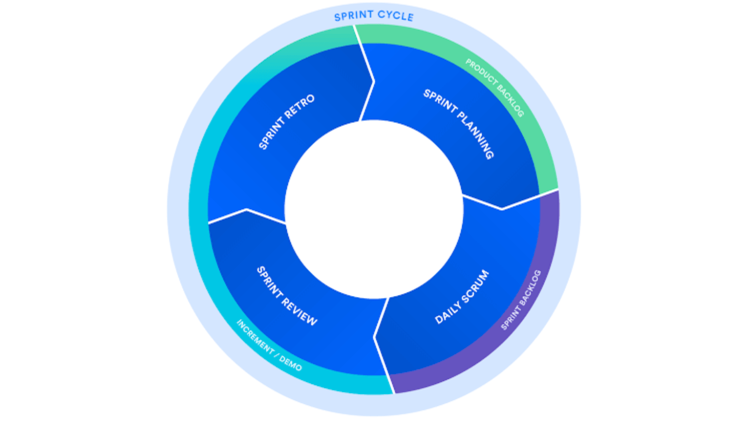 Credit: Atlassian
We used Jira Software to track the teams progress and all work items, a product backlog was created at the beginning of the project and updated as per client requests or when bugs were found. The team then assigned items to the sprint backlog in sprint planning meetings and throughout the sprints each team member would update the time tracking and task status fields so everyone could stay informed on the teams progress.
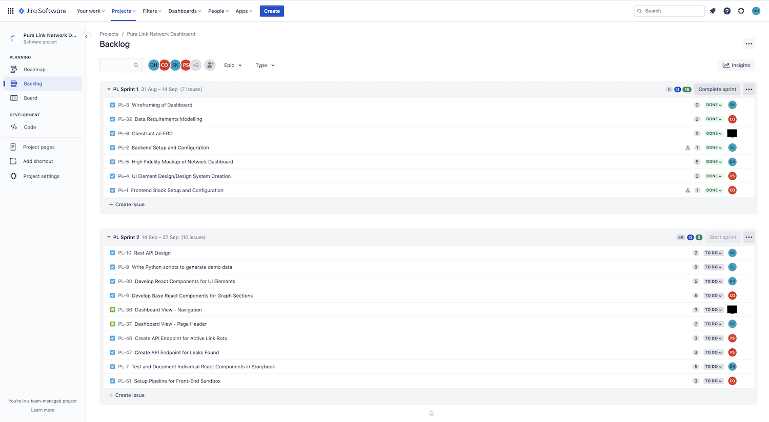 Using Jira to manage our product and sprint backlogs. Sprint 1 and 2 backlogs are shown.
Confluence was used for all project documentation including minutes from ceremonies such as sprint planning, stand-up, sprint review and sprint retrospective. This allowed the team and clients to find all the necessary information about the project in one place.
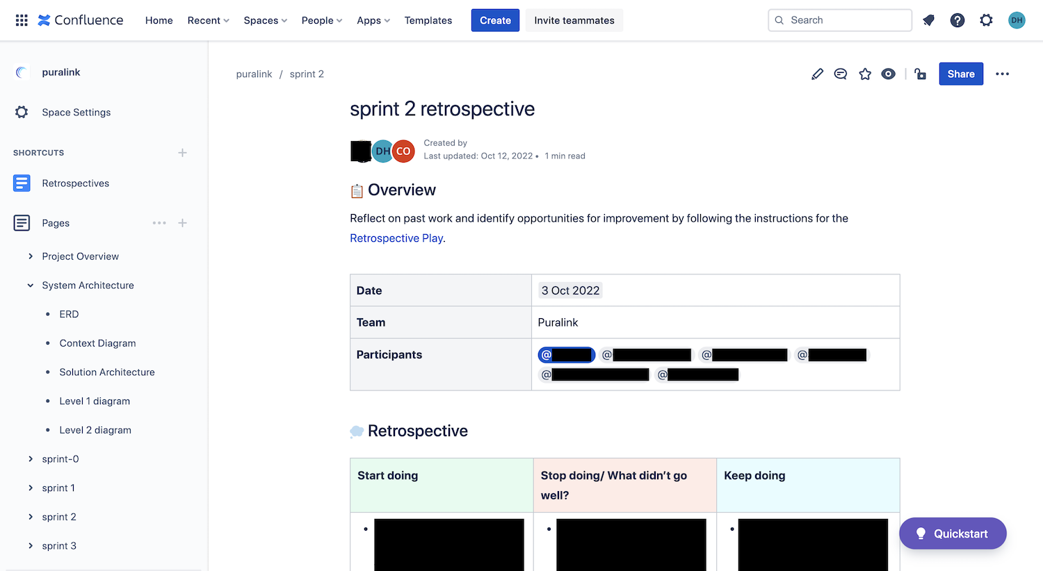 Using Confluence to manage all project documentation. Information redacted for team members privacy.
As part of our assessment and the software development process, Software Requirements and Solution Architecture Reports were also produced and included in the project handover documentation.
Design
The client had provided a concept design for the dashboard but invited our team to improve on it. While the provided design gave a good indication of the desired functionality and types of data visualisations, it did not look professional and needed a bit of work from a UI perspective to appeal to the market and position Pura Link as the leading enterprise solution. As a team we decided to spend time improving on the UI to not only make it appear more professional but to achieve the Aesthetic-Usability Effect where users perceive aesthetically pleasing design as design that’s more usable.
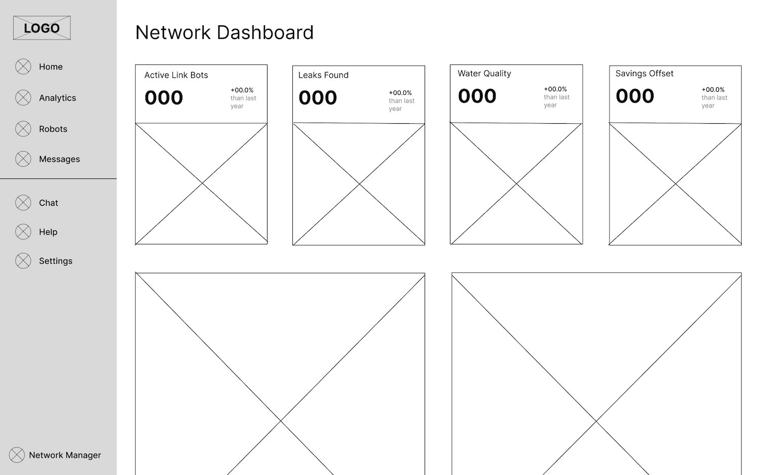
 The original design provided by the client.
Our team began improving on this design by researching examples of existing analytics dashboards. We constructed a moodboard and then used this, along with the Pura Link brand styles to inform our own designs.
 Condensed version of our moodboard.
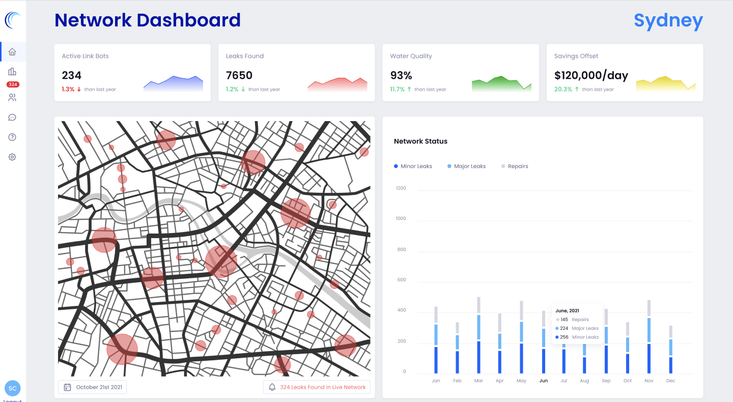
From here the layout of the dashboard was planned with wireframing. We went through a few reivisons but eventually settled on the original layout which has the summary statistics in a row up the top and the location map and detailed leak counts as bigger blocks on the second row. The benefit of this two row design is that users can see all the key information about the health of their network at a glance without scrolling or digging through menus, then if they wish to dive deeper can simply scroll down.
We decided to move the graphs for the summary statistics to underneath each statistic in order to give the graphs more space so the data can be read clearly and users can interact with the graphs with their mouse. Having the tiny graphs next to each statistic as in the original design meant that users can only see the general trend of the graph and can't access any valuable information such as a month by month breakdown or even determine the timespan.
 The wireframe that informed our final layout.
Once we had the layout, the next step was to determine the visual style and design the interface. Working off the wireframes, moodboard and brand styles we developed a few different options until we arrived at our final high-fidelity mockup.
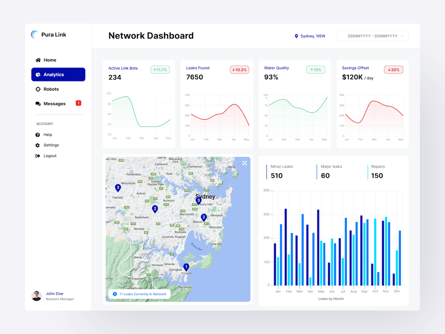 The design selected for development. Made using Figma.
The dashboard takes on a simple, light design that allows users to easily check on the status of their network. Graphs are displayed with colour coding to help users instantly recognise positive or negative trends or additional information in a dataset. Rounded corners help with making the dashboard feel more approachable and easy on the eyes. The use of a consistent design language reduces the time spent learning and helps with avoiding confusion when extending functionality in the future as users will be familiar with the interface.
The sidebar style navigation is consistent with other dashboards users may have used and allows for quick navigation to many pages. As Pura Link expands, the use of a sidebar will aid scalability as many more top-level items can be added to a sidebar than a top menu. The sidebar collapses on smaller screens by hiding the text but remains visible at all times with clear icons supporting quick navigation.
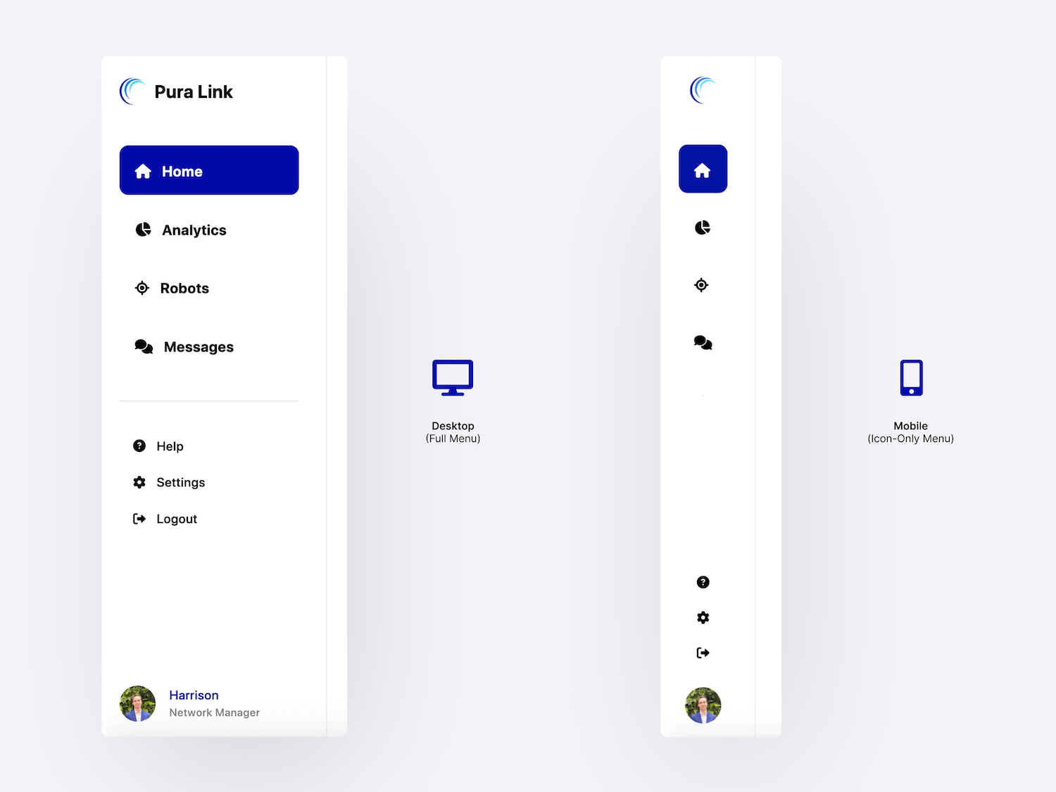 Responsive sidebar navigation. The sidebar collapses on mobile to save space while still allowing quick access to key pages.
Since Pura Link is an entirely new solution, the decision was made to have the sidebar display the names of pages by default on desktop devices to aid in introducing users to the new platforms functionality. In the future an option to collapse the sidebar on desktop (as opposed to only collapsing automatically on mobile) could allow for larger graphs and more data to be displayed on the screen which will be useful in improving the user experience as Pura Link expands it's data collection capabilities.
Development
The nature of the project meant that the technologies had to be carefully selected to allow for fast prototyping and ease of future expansion.
For the front-end we opted for Next.js due to it's file-based routing allowing for quick prototyping and the clients preference for a JS-based front-end. After testing a few different libraries we chose Recharts for data visualisation for it's great documentation and use of D3. SWR Hooks are also used for data fetching.
To help Pura Link expand it's front-end we also setup Storybook which assists with component development, documentation and testing.
For the back-end the client requested that we develop Python scripts for generating dummy data and connect to their Azure SQL database. Due to the app being heavily analytics focused and the requirement to use Python for data generation, we decided to extend the use of Python throughout the entire back-end by using Django for our API. Django integrates nicely with python-based data libraries and allows us to easily intergate the data generation functionality into the API so it can be controlled from the front-end.
Our app follows a client-server architecture with the front-end and back-end being seperated and communicating with a Rest API. This architecture was chosen to promote scalability and allow for seperation of concerns. The UI and data processing can be developed and scaled independently with different technologies used for each.
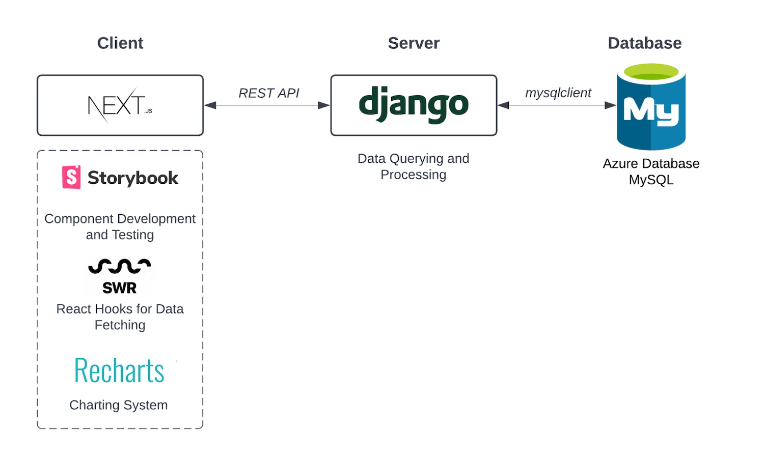 Overview of our chosen tech stack and architecture.
For version control the team used GitHub, aligning our branches and pull requests with Jira Issues. GitHub actions was then used to setup a simple CI/CD pipeline to deploy our app for testing and demonstrations.
Along with developing all the required analytics dashboard functionality, our team proposed and successsfully implemented a stretch-goal of allowing the data generation process to be controlled from the web app. Rather than manually running python scripts, I developed an additional page on the web app where the client can generate demo data for presentations in a few clicks.
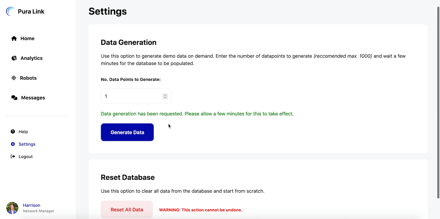 Extra functionality to control demo data generation from the dashboard.
Outcomes
- All project requirements fullfilled including the stretch-goal.
- The client is satisfied with the solution and is adopting it within the company.
- High Distinction grade was awarded for the project assessment.
- Jira and Confluence skills learnt in this subject were used to earn fundamentals certifications.